IPCC computer models do not accord with observations
The graphic below reveals the IPCC global warming hypothesis to be overblown scaremongering. The graphic is taken from a draft of the IPCCs September 2013 report.The coloured portions of the chart show various IPCC computer projections. The actual observations (in black) show no noticeable increase in global temperatures for the past 15 years, notwithstanding millions of tonnes of extra CO2 being pumped into the atmosphere.
When the IPCC realised the graphic gave the game away, it was quietly substituted by a more obscure graphic in the final report.
 |
Figure 1. Second Order Draft Figure 1.4. Yellow arrows show digitization of cited Figure 10.26 of AR4.
Steve McIntyre of Climate Audit website, had this to say about the IPCCs subterfuge:
Figure 1.4 of the Second Order Draft clearly showed the discrepancy between models and observations, though IPCC’s covering text reported otherwise. I discussed this in a post leading up to the IPCC Report, citing Ross McKitrick’s article in National Post and Reiner Grundmann’s post at Klimazweiberl. Needless to say, this diagram did not survive. Instead, IPCC replaced the damning (but accurate) diagram with a new diagram in which the inconsistency has been disappeared.
Here is Figure 1.4 of the Second Order Draft, showing post-AR4 observations outside the envelope of projections from the earlier IPCC assessment reports (see previous discussion here).
Now here is the replacement graphic in the Approved Draft: this time, observed values are no longer outside the projection envelopes from the earlier reports. IPCC described it as follows:
Even though the projections from the models were never intended to be predictions over such a short time scale, the observations through 2012 generally fall within the projections made in all past assessments.
|
|
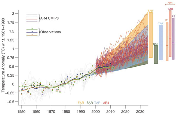
Figure 2. Approved Version Figure 1.4
So how’d the observations move from outside the envelope to insider the envelope? It will take a little time to reconstruct the movements of the pea.
In the next figure, I’ve shown a blow-up of the new Figure 1.4 to a comparable timescale (1990-2015) as the Second Draft version. The scale of the Second Draft showed the discrepancy between models and observations much more clearly. I do not believe that IPCC’s decision to use a more obscure scale was accidental.
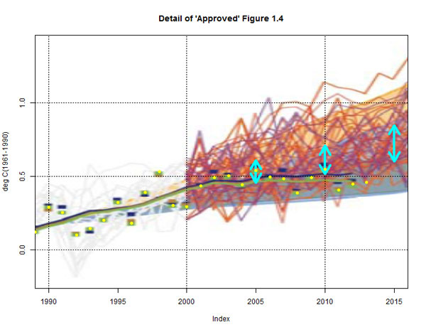 |
Figure 3. Detail of Figure 1.4 with annotation. Yellow dots- HadCRUT4 annual (including YTD 2013.)
First and most obviously, the envelope of AR4 projections is completely different in the new graphic.
From here, the discussion gets fairly technical. Read the whole article at Steve McIntyre’s website